The Kit* features I love
(and why I don’t want to share them with you): Part 4 of the Considering Kit series
*formerly ConvertKit

Click here if you missed parts of the Considering Kit series
I’ll be honest: I majorly procrastinated writing this part of the Considering Kit series.
Kit is a tool I love, and this writeup is about what I love about it.
So why the procrastination?
Because I’m an affiliate. Which means that, while, yes, I ultimately want you to choose the best tool for your needs, I think Kit is the best tool for your needs. (Unless you’re not a Creator. You read Part #2, right?)
So I want you to read this feature list and be wowed.
But most of what I love about Kit feels so… unimpressive.
I even asked ChatGPT and Perplexity what users love about Kit and, yeah. The stuff they listed are things that should be a no-brainer for an email platform.
- It should be basic that UX not feel like navigating a hedge maze.
- It should be basic that loading automations not feel like watching paint dry.
- It should be basic that chatting support not feel like climbing an Escher staircase.
The problem though… is that these things are not basic at all.
If you’re frustrated with your current platform, you know this. If you haven’t started your list yet, well, now you know it too. It is absolutely astounding how ridiculously clunky most email platforms are.
So… I will silence the procrastination voice and proceed.
Here’s what I love about Kit:
It’s intuitive
Everything makes sense. Things are clean and organized. Elements are where you expect them to be. And it’s really easy to see everything at a glance – be it the dashboard or your giant 70-step automation.
Even just the navigation menus are broken down really well.

It’s fast
My biggest pain point when I was using ActiveCampaign was how slow it was. It was soooooooooo annoying to use. Not to mention how wasteful it felt to pay my VA to watch things load. Speed is absolutely not an issue with Kit, no matter how big your automation is. (Partly because of their clever Sequences feature. Which brings me to:)
This is a super interesting way of approaching automations that is really helpful at keeping things lightweight and “see it at a glance.”
Every step in the automaton is packed up – you click into it to see more details. This is fairly typical for things like tags, but for filters it’s less expected – and for the actual emails within the automation it’s definitely different. Kit totally separates Sequences (the emails) from the Automations (all the automated stuff in the flow, including tags or triggers, etc.)
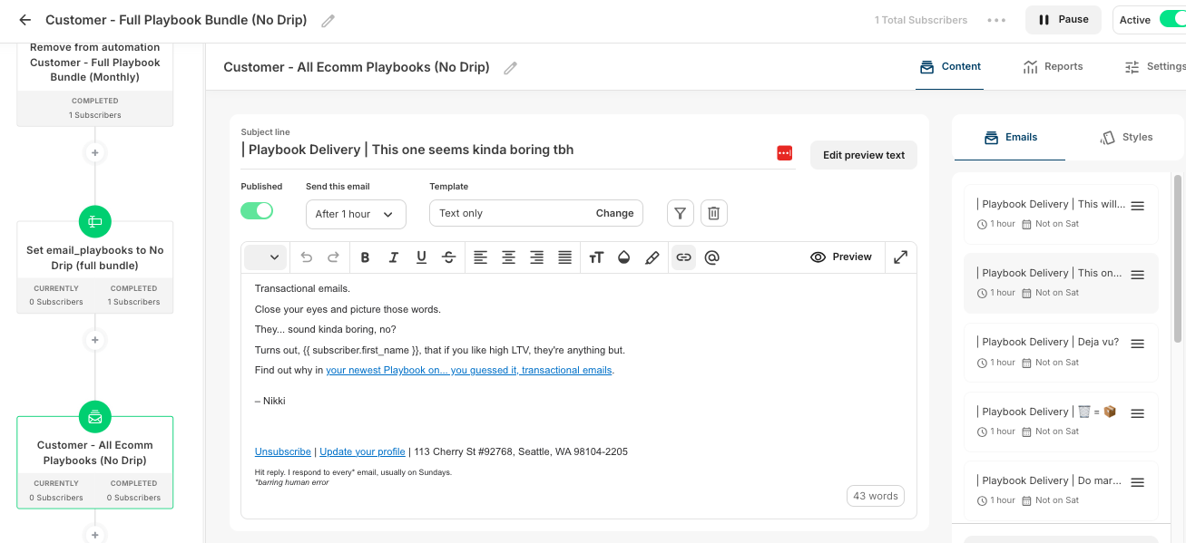
👆 This screenshot is when you click into a Sequence that lives within an Automation. In the left sidebar, you can see a part of the full Automation, which includes all the technical tagging and segmenting bits, as well as the emails. On the right, you can see how alllll the Sequence emails are packed into that one little last visible step in the Automation sidebar. See how clean it keeps the automation?
In addition to keeping things clean, it also increases functionality.
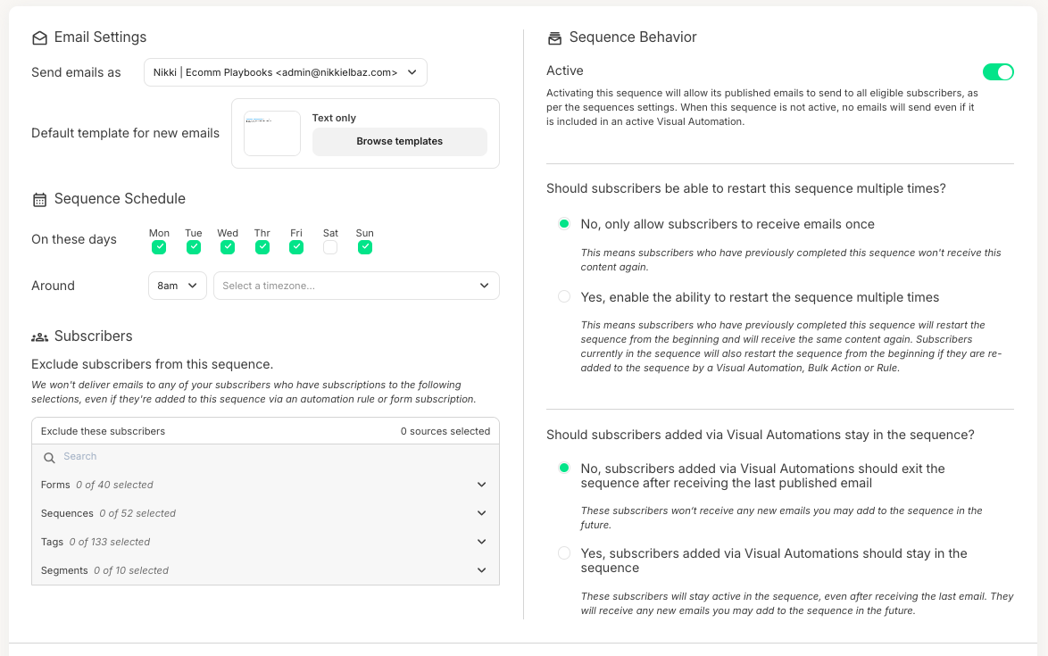
👆See how you can pause the emails but keep the automation active? That’s useful for a waitlist, for example. Plus, you can keep adding emails, and subscribers will keep getting them, even after they finish the Sequence – because they’re still in the automation. I originally wrote this post as an email series – and this feature would have been a perfect fit, since I wrote it as I went along.
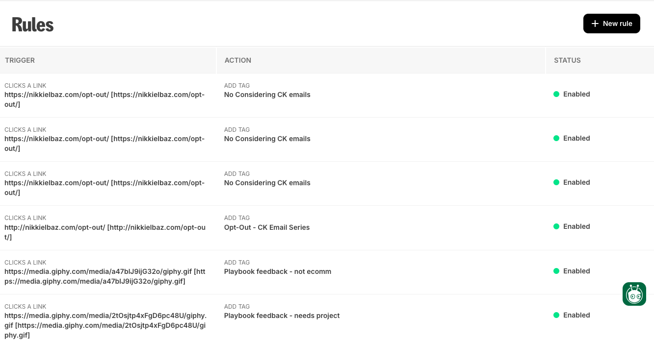
This is a little luxury feature that I really like: a link library that triggers subscriber tags. Yes, you can trigger tags easily enough while you’re building your campaign or automation, but it’s really nice to be able to prep things in advance. Especially for big launches with multiple segments – my VA can start setting up opt-outs or other triggers before I even start on the emails.
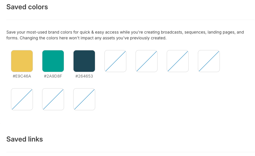
This is such a time saver. Again, a bit luxurious, because we often just duplicate previous emails, so we have the colors already inputted. But for when we aren’t duplicating emails, it’s great not having to dig up the Slack thread with our brand colors to copy-paste in the HEX codes.
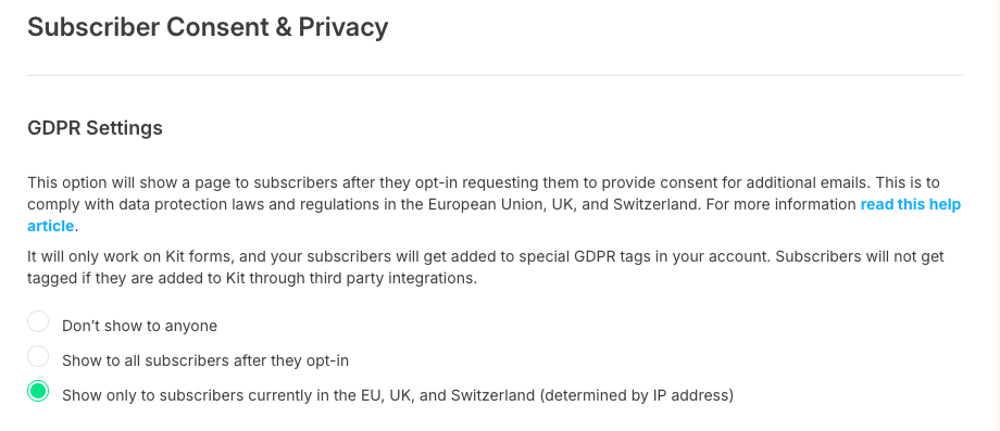
EU-specific GDPR settings
I don’t often think about this feature because it’s a set it and forget it kind of thing, but I love how you can get granular about who gets double opt-in.
Oh, and the other reason I’ve been procrastinating this?
I’ve been woefully barefoot-shoemaker with my emails lately. I have this running list of features to check out, including:
First up, because it’s a brand new feature!
No more getting pulled into the Giphy black hole — just open the inline library and embed that typing cat GIF. No more downloading and uploading Canva images — just open your native media library and find the design you made 2 weeks ago. And if you’ve ever experienced the hair pulling adventure of attempting to add an Add to Calendar button into an email, you’ll be stoked about the SaavyCal integration — just add your webinar link and voila!
With everything directly integrated into emails from the apps in the Kit App Store, things are just way less clunky. Super exciting, no?
When people opt in to your list, it pops open a lightbox with other email lists you recommend. And whoever you recommend gets prompted to recommend you too. Just a nice list growth opportunity. Not sure how effective it will be with a niched list at my size, but every little bit counts, right?
I despise the way my emails are formatted. I find them impossible to read – and I’ve even had subscribers tell me this (!). I definitely need to prioritize fixing this – and I’ve been hearing again and again how the Kit templates are really nice, even out of the box.
Plus, I’ve been tempted to experiment with designed emails. I know, shocking! Plain text is obviously very personal, but sometimes a little color adds fun – and clarity.
I experimented with this once, it didn’t work, and our timeline was too tight to work it out, but it is so so cool and I should definitely try again. You can customize what content your subscribers see, based on their tags or custom fields. So, for example:
I first wrote up this post as an email series. And I put this blurb at the end the first email in this series. I could have cleaned up all the IF you did this THEN this, IF you did this THEN that – and only shown it to those who opted out.

This is something I just discovered when taking all the screenshots for this post and I’m excited to set it up. If you have things you promote or include frequently, you can create a snippet for it, and easily add it into your various emails. I’m planning on using it for the opt-out blurb on my podcast emails. It could also be useful pre-launch when you’re promoting a waitlist or pre-order. And it could be a nice way to play with your signature without having to change your template.
Here’s another thing I discovered while screenshotting features for this email. You can make a super functionali link-in-bio page with Kit. The capabilities are way more robust (you can embed video, your Insta feed, etc.), you don’t have to pay another platform to access full features – and best of all, you can include an email signup form!
Those are the things that make it easy to run my email list
What feature are you most curious about?
And sure, it’s not always fun and games.
Read on for: Features I hate or miss
Don’t forget: free consult to set up or improve your email list
Sign up for Kit with my affiliate link, you’ll get a coupon code for a free 30-minute consult ($175-$197 value). Use our time together to develop your content strategy… brainstorm offers… polish your welcome flow – or whatever else you need to make your email list work for you.
The links included are affiliate links and I’ll earn a commission if you purchase a plan. This costs you nothing extra, and you’ll earn a free strategy consult – woohoo!
